
Color Tests for Spiritual Death
- Barbara Diniz
- Feb 22
- 3 min read

Barbara Diniz
Every collection begins with an idea before it begins with an image.
For Spiritual Death, the conceptual foundation was established first. The text defined the direction. It clarified the internal condition I wanted to confront. Only after that did I begin making visual decisions.
The first decision was chromatic.
If the collection addresses spiritual death, what color language carries that weight without becoming theatrical or illustrative?
Two colors emerged as structurally necessary: purple and brown, specifically sepia.
Purple represents sadness. It is the color of bruising. When skin is wounded, it turns purple. Hurt becomes visible. Purple also appears in decay. As flesh decomposes, it shifts toward a purplish tone. Death carries sorrow. Purple holds that reality without exaggeration.
Brown represents clay, dirt, flesh, the old creature. It reminds us of origin and limitation. From dust we came. Brown grounds the spiritual in the material. It refuses transcendence. It pulls the composition downward.
Together, purple and brown create a restrained palette. Heavy. Earthbound. Without celestial relief.
Before designing finished works, I began testing these colors on A4 card paper. Not with detailed planning. Not with narrative scenes. I allowed myself to explore freely in a series of abstract studies.


I tested:
How much purple before it becomes sentimental rather than sorrowful. How much brown before the surface collapses into monotony. How the two interact when layered wet on wet. How they behave when one dominates the field.
On paper, sepia absorbs unevenly. It stains quickly. Purple, when diluted, can appear luminous at the edges but heavy at the center. When layered without restraint, both colors can suffocate the surface.


Several studies failed.
Some became visually flat. Some became overly dramatic. Some lost symbolic clarity and felt decorative rather than diagnostic.
But within those abstract experiments, compositional structures began to surface.
At a certain point in the series, two images emerged with clarity.
The first composition developed inside the interior of an empty airplane cabin. Only one skeleton sits among the seats.


The airplane represents elevation. Rising. Ascending. Success. Movement upward. But the emptiness shifts the meaning. There is no life inside the ascent. The skeleton becomes a quiet indictment. Sometimes we allow ambition, pride, or elevation to dominate our thinking. We rise, but spiritually we are empty. We forget what is essential.
The second composition formed around an open refrigerator. Inside are feet.
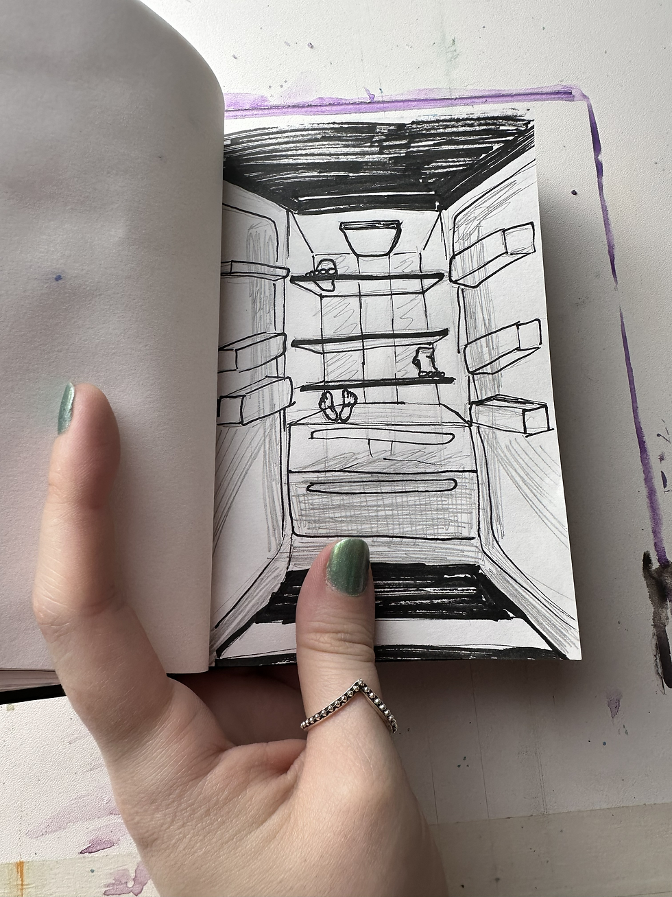

Feet in my symbolic vocabulary represent our walk. The direction of our life. The path we follow. A refrigerator suggests coldness. In this case spiritual coldness.

The image is unsettling by design. It confronts the condition of misdirected priorities. What are we preserving? What are we feeding? What are we storing away while neglecting the path we were meant to walk?
The compositions did not begin as narrative illustrations. They emerged from chromatic exploration. From repeated testing of purple and brown in tension. The palette shaped the atmosphere before the imagery solidified.
This process confirms something essential in my practice.
Concept determines color. Color shapes structure. Structure allows imagery to appear.
If the color system is wrong, the image collapses. If the palette is unstable, the message becomes confused.
Spiritual death cannot be painted in celestial blue. It cannot be constructed with hopeful green. The palette itself must embody the condition.
These experiments are still ongoing. Not every study will become part of the Fragments. Some will remain in archive as evidence of process only.
But through repetition, failure, and refinement, the visual language becomes clearer.
The goal is not shock. It is precision.
Spiritual death is a serious matter. It's usually a disease that is gradual. It is often invisible until the structure has already decayed.
The palette must reflect that.
And so the work continues. Layer by layer. Test by test. Decision by decision.


Comments